 Partners


 Download
 Buy
BuyPostgreSQL PHP Generator online Help
| Prev | Return to chapter overview | Next |
Text
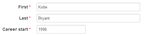
Select this control to create a single-line input field for entering text. Live Demo.
Related editors
To create a multi-line input, use the TextArea editor. To allow user to enter only valid characters, use the MaskEdit editor. To provide user with a list of pre-defined values, use the AutoComplete editor. To restrict user to select only a pre-defined value, use Radio group, Combobox, Dynamic Combobox, Cascading Combobox, or Dynamic Cascading Combobox editor.
Max width
Use this property to restrict the maximum width of the editor (this means that in any screen resolution editor's width will be less or equal then the property value). Can be specified in any units supported by web browsers e.g. 300px, 25em, 50%, etc.
Max length
Use this field to restrict the number of symbols of the value that can be entered.
Placeholder
Use this field to set a short hint that describes the expected value of an input field (e.g. a sample value or a short description of the expected format). The placeholder is displayed in the input field before the user enters a value.
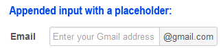
Prefix/Suffix
Use these properties to create prepended and appended inputs allowing for simple punctuation or units to be paired with an input. For example, if you need to indicate a field is asking for money, use the prepend with a $ sign. Other examples include @ with a username (a la Twitter.com's settings pages) and "+1" for phone number inputs.
Inline styles
Use this field to set formatting options to be used inside the style attribute of the element. For example, to set the font color and the background color for a control, place the following string to Inline styles:
color: red; background-color: yellow;
Custom attributes
This property allows you to add simple metadata to individual elements, largely for the purpose of providing information to make JavaScript functions easier. Such attributes can be later handled in client-side events. For example, to add several custom attributes to an editor, enter the following string into the Custom attributes edit box:
data-city="Boston" data-lang="js" data-food="Bacon"
It is recommended to prefix all custom attributes with data- to keep the result document compatible with the HTML5 requirements.
HTML filter
Use it to strip unwanted HTML tags and attributes from user input. By default all tags and attributes are stripped out, so you have to define allowed items explicitly.
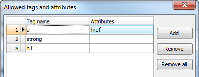
Settings on the screenshot above are to allow the <a> tag (optionally with the href attribute as well as the <strong> and <h1> tags. All other tags and attributes will be removed from the user input.
| Prev | Return to chapter overview | Next |