 Partners


 Download
 Buy
BuyDB2 PHP Generator online Help
| Prev | Return to chapter overview | Next |
Options
This tab allows you to specify page options. By default values of these options are set according to the corresponding values specified in the Project Options dialog. To change settings for a certain page, uncheck the Use default options checkbox first. Click Reset to defaults to reset these options to their default values defined at the project level.
Common
These options are applied for all generated pages.
Content encoding
The default option value is UTF-8 and you must have really good reasons to change it.
Page direction
Allows you to select between Left-to-right and Right-to-left page directions.
Modal form size
A preferred size (default, small, or large) for View, Edit, and Insert modal windows.
Hide sidebar menu by default
If checked, the sidebar menu will be closed until a user opens it manually.
List
These options are applied for List views (both grid and card).
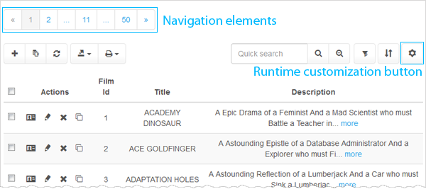
Page navigator
Allows you to specify the position of the navigational control(s) and the default number of records displayed on the page. This value may be changed by application users in runtime if the Runtime Customization option is enabled.
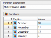
To create a custom pagination, use Data Partitioning.
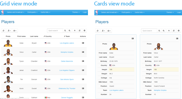
View mode
Select whether page data are displayed in a grid or as info cards. The end-user can easily switch from the grid mode to the card one and vice versa using the Page Settings dialog (if the Runtime Customization option is enabled).
Number of cards in a row
Allows you to specify maximum number of cards displayed in a row for each screen resolution. These values also can be changed by end-users if the Runtime Customization option is enabled. Live Example.
Control buttons position
Select whether the Edit, View, Delete, and Copy buttons to be displayed on the left side of the generated page or on the right side. Live Example.
Bordered table
Check this option to add borders on all sides of the table and cells. Live Example.
Condensed table
Turn this option 'ON' to make tables more compact by cutting cell padding in half. Live Example.
Highlight row at mouse over
Allows you to enable/disable the highlighting of rows at mouse over.
Use images for actions
Defines whether images or text captions are used for control buttons (like Edit, View, or Delete).
Use fixed grid header
Allows you to make the grid header are non-scrollable. Live Example.
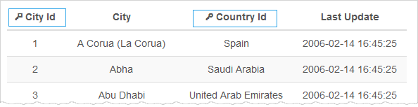
Show key columns images
Turn is 'ON' to mark key columns with the 'key' images.
Show line numbers
Check this option to add row numbering to the grid. Live Example.
Edit/Insert
These options are applied to data input forms.
Display "Set NULL" checkboxes
Defines whether "Set NULL" checkboxes are displayed for each control in Edit and Insert forms.
Display "Set Default" checkboxes
Defines whether "Set Default" checkboxes are displayed for each control in Edit and Insert forms.
Error message placement
Allows you to select the placement for error messages. Possible values are "Below the form", "Above the form", and "Below and above the form". Default value is "Below the form".
Reload page after Ajax operations
Allows you to reload the page after Inline or Modal editing/inserting.
| Prev | Return to chapter overview | Next |