 Partners


 Download
 Buy
BuyDB2 PHP Generator online Help
| Prev | Return to chapter overview | Next |
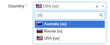
Dynamic Combobox
Select this control to create a combination of a single-line editable textbox and a drop-down list filtered according to values entered in the textbox. It is recommended to use this editor type as lookup editor to work with a big number of records. Live Demo.
Related editors
In Dynamic Combobox items are filled on-the-fly, so this control is the best choice when you have a sufficiently large number of items. If number of items is not exceed 10-15, consider to use "classic" Combobox as it works slightly faster.
To allow user to select the value step-by-step (for example, first select a country, then a city in the selected country), use Cascading Combobox or Dynamic Cascading Combobox editors.
Max width
Use this property to restrict the maximum width of the editor (this means that in any screen resolution editor's width will be less or equal then the property value). Can be specified in any units supported by web browsers e.g. 300px, 25em, 50%, etc.
Allow clear
Turn it ON to allow end users to clear the selected value using special button.
Minimum input length
Use this option to specify minimal amount of symbols to start the search (useful for large lookup datasets where short search terms are not very useful).
Number of values to display
Defines the number of lookup values to be displayed in the drop-down list.
Item caption template
This option allows you to populate the combobox with values of several columns. For this purpose, specify a template to be used for each item in the list.
Inline styles
Use this field to set formatting options to be used inside the style attribute of the element. For example, to set the font color and the background color for a control, place the following string to Inline styles:
color: red; background-color: yellow;
Custom attributes
This property allows you to add simple metadata to individual elements, largely for the purpose of providing information to make JavaScript functions easier. Such attributes can be later handled in client-side events. For example, to add several custom attributes to an editor, enter the following string into the Custom attributes edit box:
data-city="Boston" data-lang="js" data-food="Bacon"
It is recommended to prefix all custom attributes with data- to keep the result document compatible with the HTML5 requirements.
Formatting functions
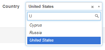
Use these functions to format search results and the selection. For example, it is possible to use fonts, colors, images, and so on. All you need is to specify two functions in JavaScript each of which accepts the current item as a parameter and returns the HTML code to represent search results and the selected item accordingly. In the example below search results are displayed in italic and the selected item is displayed in bold.
formatResult function:
return '<i>' + item.text + '</i>';
formatSelection function:
return '<b>' + item.text + '</b>';
The editor now looks as follows:
| Prev | Return to chapter overview | Next |