 Partners


 Download
 Buy
BuyDB2 PHP Generator online Help
| Prev | Return to chapter overview | Next |
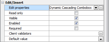
Dynamic Cascading Combobox
Dynamic Cascading Combobox is a series of 2 or more dynamic comboboxes in which each combobox is filtered according to the selection in the upper combobox. Select this editor to get greater control over data input, and to make things easier for the user. The number of levels is not limited. Live Demo.
Note: regardless of the number of levels this control is intended to select a single value.
Related editors
In Dynamic Cascading Combobox items in all levels are filled on-the-fly, so this control is the best choice when all or any of the levels can contain a sufficiently large number of items. If number of items is not exceed 10 for all levels, consider to use the Cascading Combobox as it works slightly faster.
Max width
Use this property to restrict the maximum width of the editor (this means that in any screen resolution editor's width will be less or equal then the property value). Can be specified in any units supported by web browsers e.g. 300px, 25em, 50%, etc.
Allow clear
Turn it ON to allow end users to clear the selected value using special button.
Minimum input length
Use this option to specify minimal amount of symbols to start the search (useful for large lookup datasets where short search terms are not very useful).
Number of values to display
Defines the number of lookup values to be displayed in the drop-down list for each level.
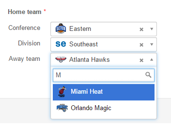
Formatting functions
Use these functions to format search results and the selection. For example, it is possible to use fonts, colors, images, and so on. All you need is to specify two functions in JavaScript each of which accepts the current item as a parameter and returns the HTML code to represent search results and the selected item accordingly. Formatting functions can be specified at the level basis. The screenshot below is from our NBA demo application:
Inline styles
Use this field to set formatting options to be used inside the style attribute of the element. For example, to set the font color and the background color for a control, place the following string to Inline styles:
color: red; background-color: yellow;
Custom attributes
This property allows you to add simple metadata to individual elements, largely for the purpose of providing information to make JavaScript functions easier. Such attributes can be later handled in client-side events. For example, to add several custom attributes to an editor, enter the following string into the Custom attributes edit box:
data-city="Boston" data-lang="js" data-food="Bacon"
It is recommended to prefix all custom attributes with data- to keep the result document compatible with the HTML5 requirements.
Levels
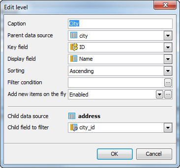
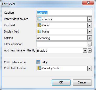
Here you can select and setup data sources to be used for additional controls. Levels should be added in the reverse order of logical priority, i.e. if our goal is to create a 3-level control that allows user to select a country, then a city in the selected country, and then an address in the selected city, we need to add the City level first and the Country level after that.
To add a new level, click Add level and setup its properties as described below. Click Edit level to edit the properties of an existing level. To delete a level, click Remove level (only a level from the top of hierarchy can be removed).
Level properties
The following properties can be set for each level:
Caption
Caption of the corresponding control.
Parent data source
Data source for the level. The value of this property can be edited only for the top level (Country in our example).
Key field
A column from the data source above to be used to filter values in the low level control. The value of this property can be edited only for the top level (Country in our example).
Display field
A column, which values are displayed at this level.
Sorting
Defines the sort order for the level's items. Possible values are Ascending, Descending, and None. The last one allows to use a native sorting order of their data sources.
Filter condition
This property allows you to restrict number of displayed values. Variables like %CURRENT_USER_ID% are allowed.
Add new items on the fly
Defines whether a user is allowed to add items at this level. If enabled, a plus button is displayed on the right of each level. Pressing this button opens a modal window where user can enter a value that does not exist in the item list.
Child data source
The parent data source for the previous level. For the first level it is the lookup data source defined for the "initial" column, i.e. for the column for which we want to use this editor. This property cannot be edited.
Child field to filter
Field from the child data source, which values will be filtered by the values of the Key field property (see above). This property can be edited only for the top level (Country).
Example
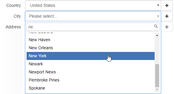
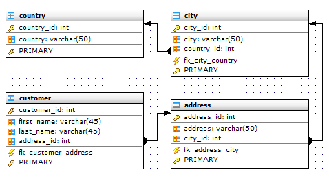
Let's consider step-by-step building of Country -> City -> Address control. Assume our database schema is as follows:
Our goal is to create a three-level editor like this one:
1. Open Page Editor for a table containing the address_id column, select this column and specify its lookup properties. If a foreign key constraint is defined and the Setup lookup by foreign key option is enabled, these properties are set automatically.
2. Select Dynamic Cascading Combobox as edit control and click the ellipsis button to open the Edit properties dialog.
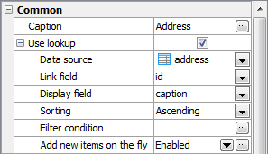
3. As described above, data sources for additional levels are placed in the reverse order of logical priority. The data entry order would be Country, City, and then Address, so the first additional level is intended for selecting a city. To add a new level for the control, click Add level and fill fields in the dialog window as follows:
4. Add the next level in the same way:
That's all. Click OK to save all settings and return to the Page Editor.
| Prev | Return to chapter overview | Next |