 Partners


 Download
 Buy
BuyDB2 PHP Generator online Help
| Prev | Return to chapter overview | Next |
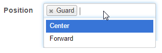
Multiple select
Select this control to provide the user with the ability to select multiple items. It provides the same functionality as Checkbox Group (i.e. allows you to select multiple options for a single field) but looks much different and requires less space in the forms. Live Demo.
Changing the control type to Checkbox Group creates this multi-choice control with the same properties.
Max width
Use this property to restrict the maximum width of the editor (this means that in any screen resolution editor's width will be less or equal then the property value). Can be specified in any units supported by web browsers e.g. 300px, 25em, 50%, etc.
Values
You can separate values to be represented in the control and values stored in the database. For this purpose use the dialog opened by the ellipsis button and enter the values you need, or add them manually as pairs stored_value=value_to_be_represented separated by commas (Example: 1=One, 2=Two).
Maximum selection size
This property allows you to restrict number of items that can be selected simultaneously.
Retrieve values from database
Turn this option ON to fill in the control with values from a database.
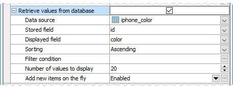
Data source
Data source name to retrieve values from.
Stored field
Data source field name to retrieve stored values from.
Displayed field
Data source field name to retrieve displayed values from.
Sorting
Sorting order of displayed values in the editor.
Filter condition
Allows to reduce the list of values represented in the editor with a specified criteria. This condition corresponds to the WHERE clause applied to the data source (you must not add the WHERE keyword to beginning of the condition). The following operators can be used in this clause: =,<> (!=), >, <, >=, <=, BETWEEN, LIKE, IN. It is also possible to use predefined variables like %CURRENT_USER_NAME%.
Number of values to display
Number of values to be displayed in the dropdown list of the editor.
Add new item on the fly
Turn this option ON to allow adding new items directly in the editor. When this option is checked, a plus button is displayed on the right of the editor.
Click the ellipsis button at the right to customize the modal dialog to be displayed when adding a new item. For example, you might want to hide some fields and/or customize the form layout.
Note: If values are retrieved from a database, hard-coded values described above are ignored and NOT included into the list of available choices.
Inline styles
Use this field to set formatting options to be used inside the style attribute of the element. For example, to set the font color and the background color for a control, place the following string to Inline styles:
color: red; background-color: yellow;
Custom attributes
This property allows you to add simple metadata to individual elements, largely for the purpose of providing information to make JavaScript functions easier. Such attributes can be later handled in client-side events. For example, to add several custom attributes to an editor, enter the following string into the Custom attributes edit box:
data-city="Boston" data-lang="js" data-food="Bacon"
It is recommended to prefix all custom attributes with data- to keep the result document compatible with the HTML5 requirements.
| Prev | Return to chapter overview | Next |